CoreAI Portal Guide
User guide for the modern CoreAI Portal experience.
The CoreAI Portal is the main user interface of BullSequana AI. It gives business users, AI engineers, and platform teams a single web surface for working with models, conversations, files, assistants, and platform-level configuration.
Access to features depends on the roles and permissions granted in your deployment.
Workspace Overview
After authentication, the portal switches into a sidebar-based workspace that acts as the main navigation shell for the modern SPA experience.
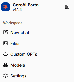
From the sidebar, users can move between the main working areas such as:
New ChatFilesCustom GPTsModelsSettings
The same sidebar also includes search over chat history, account actions, and workspace-level controls.
This matters because most of the portal features described below are not isolated pages. They are part of one shared workspace where users move between conversation, retrieval, model, and settings tasks without leaving the application shell.
Homepage
The homepage is the main sign-in entry point for the modern portal experience.
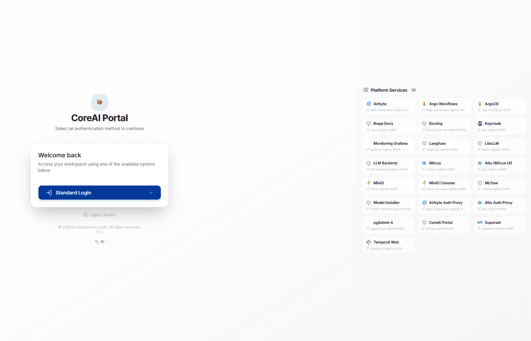
From this page, users can start the standard login flow and enter the platform through the shared SSO experience.
The Platform Services panel on the right presents the services exposed in the current environment, such as documentation, model operations, observability, storage, workflow, and administration tools.
This service list is environment-specific and backend-driven, so the exact entries can differ from one deployment to another.
In practice, this page acts as a service directory for the platform: once users authenticate through SSO, they can access the services they are entitled to use, subject to the access rights and authorization rules configured in the deployment.
Authentication
The portal uses the platform-provided SSO flow for authentication.
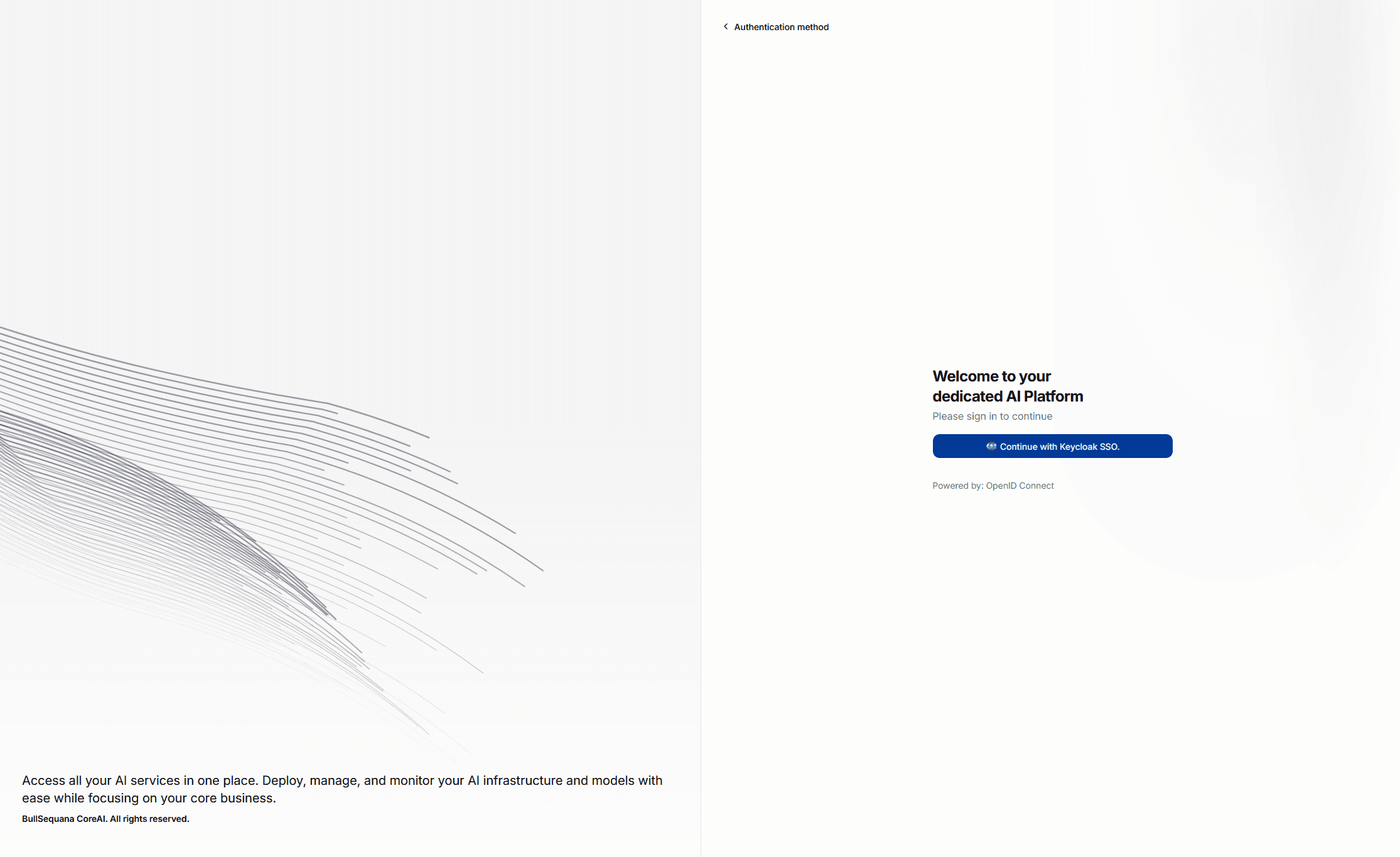
When a user starts the login flow, the portal redirects through the platform backend to Keycloak, which handles the authentication handoff and returns the user to the portal after a successful login.
In production environments, this SSO experience is typically federated with the organization's actual workplace identity provider.
That means users usually sign in with the same enterprise identity they already use elsewhere, while BullSequana AI applies its own platform access rules on top.
In development or demo environments, federation may not be configured yet. In those cases, teams often use local users created directly in Keycloak for testing and evaluation.
See Development And Demo Clusters for the Keycloak local-user pattern used in those environments.
What the Portal Is For
Use the portal when you want to:
- chat with available AI models
- upload and manage files
- check which models are available in your environment
- manage reusable assistants
- configure selected AI and platform settings
Languages and Appearance
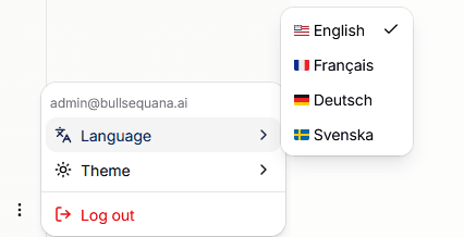
The modern portal also includes built-in language and theme controls from the sidebar menu.
Languages
The current portal locale switcher supports these languages in the application shell:
EnglishFrançaisDeutschSvenska
Changing the language updates the active locale route and reloads the portal in the selected language.
Light and dark mode
The same sidebar menu exposes theme choices for:
LightDarkSystem
The portal uses next-themes, so users can either force a specific theme or follow the system preference of their device.
Chat
The chat workspace is the main day-to-day entry point for most users.
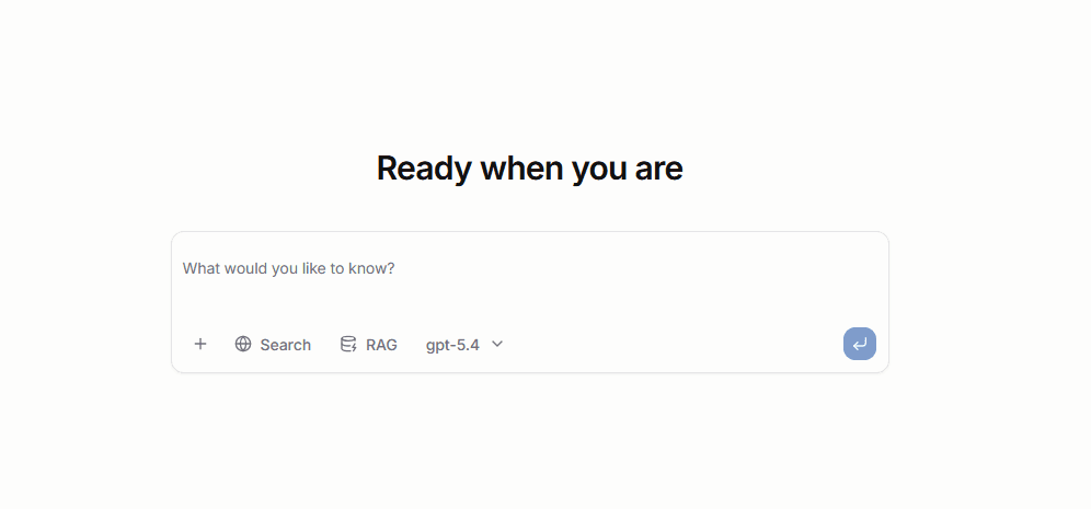
This is where users start conversations, switch between available models, and work with the retrieval and assistant features exposed in their environment.
Composer tools
The chat composer includes several important controls:
- the
+action menu for adding files to the conversation - a
Searchtoggle for web search - a
RAGpicker for selecting retrieval-ready files and folders - a model selector for choosing from available chat models and
Custom GPTs
The RAG control is connected to files that are already available for retrieval in the platform. This lets users scope a prompt to selected files or folders instead of relying only on the base model.
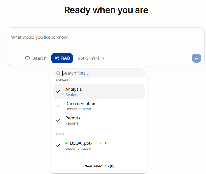
The model selector is environment-driven. It lists available chat models and also surfaces configured Custom GPTs, with recent selections shown first for convenience.
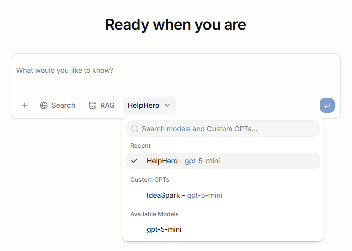
If a model you expect is missing, check the Models area in the portal or see Models for the platform-side model management view.
What users can do from chat
From the chat workspace, users can typically:
- start a new conversation with an available model
- attach supporting files to a message
- use retrieval over indexed content through
RAG - enable web search when the deployment exposes it
- switch between raw models and higher-level
Custom GPTs - revisit earlier conversations from the sidebar
Streaming and response experience
Responses stream progressively into the conversation instead of appearing only at the end.
Depending on the selected model or assistant, the UI can also show:
- source links for grounded answers
- reasoning sections when the backend exposes them
- tool and assistant activity blocks for intermediate steps
- copy actions for the latest assistant response
This makes the chat view useful not only for end-user prompting, but also for understanding how an assistant or tool-enabled workflow arrived at its answer.
Tool calls, web search, and intermediate steps
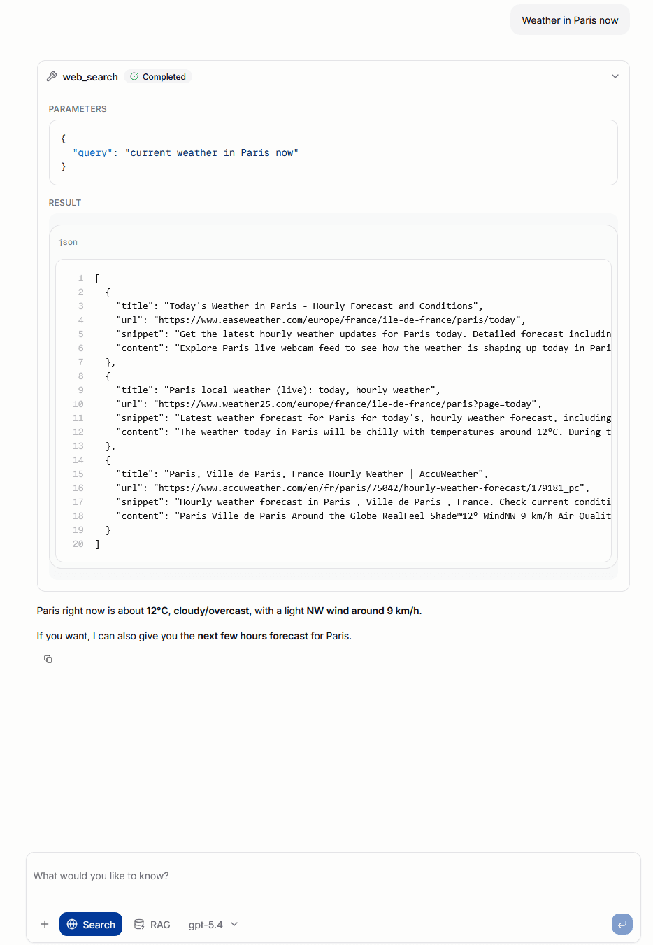
When web search or other tool-enabled behavior is active, the conversation can surface intermediate steps directly in the message flow.
That can include:
- tool names such as
web_search - the parameters sent to the tool
- structured tool results
- the final assistant answer generated from those results
This makes it easier to see when the assistant is relying on external tools instead of only generating a direct model completion.
In more agent-like flows, the same conversation area can also expose reasoning traces and other intermediate assistant activity when the backend provides them.
These elements help users distinguish between:
- the final assistant answer
- the intermediate actions the system took while producing it
This is especially useful for debugging assistant behavior, validating retrieval or tool use, and understanding why a response took longer than a simple direct completion.
Files
The files area is the document and retrieval workspace of the portal.

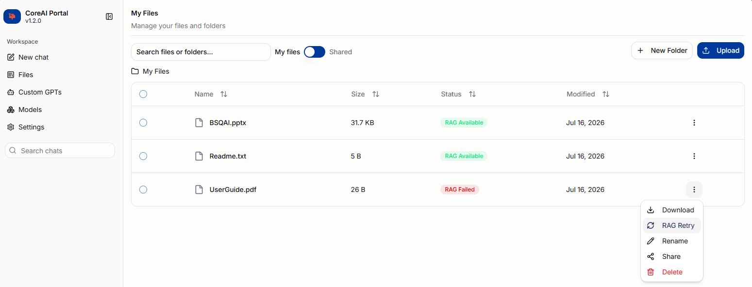
This is where users upload content, organize it into folders, and track whether a file is ready to be used in retrieval-augmented chat.
What users can do
From the Files area, users can typically:
- upload files into the current folder
- create folders and nested folder structures
- browse and search through their library
- rename or delete files and folders
- move files and folders by drag and drop
- share files and folders with other users or groups
- retry indexing for files that failed RAG processing
The page also exposes a live upload indicator so users can see when files are still being transferred in the background.
Uploading files
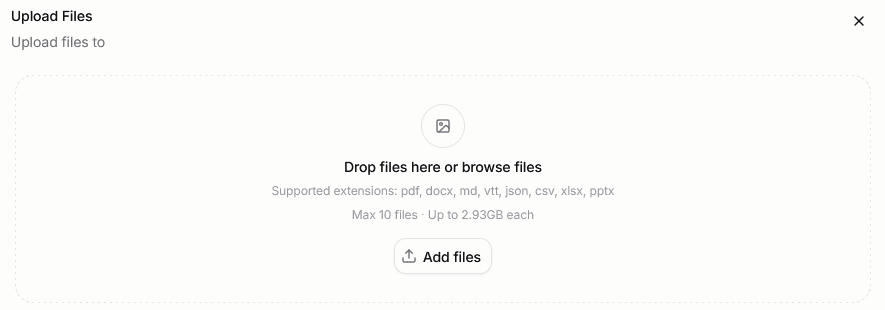
Uploading is done from the current folder context.
Users can open the upload panel from the main Upload action or from a folder-specific upload action, then drop files into that target location.
This makes it easy to keep retrieval content organized from the start instead of uploading everything into a flat top-level library.
Supported file types
The upload panel accepts files across four categories:
- Documents —
pdf,docx,md,pptx,txt,vtt - Data —
json,csv,xlsx - Code —
py,ts,tsx,js,jsx,java,go,rs,c,cpp,h,hpp,kt,swift,rb,php,cs,scala,sql,sh - Config —
yaml,yml,toml,ini
The upload panel displays these categories in a collapsible list so users can check which formats are accepted without leaving the upload flow.
OCR
OCR is enabled by default for uploaded files. The OCR engine is set to auto, which lets the backend select the most appropriate engine for each file automatically.
File status and RAG readiness
Each file carries a status that reflects whether it is ready for retrieval.
The important user-visible states are:
RAG PendingRAG ProcessingRAG AvailableRAG FailedRAG Removed
This matters because a file can exist in the library before it is actually searchable in chat.
Only retrieval-ready files can be used through the chat RAG picker. In practice, users should wait for RAG Available before expecting grounded answers from that content.
Sharing files
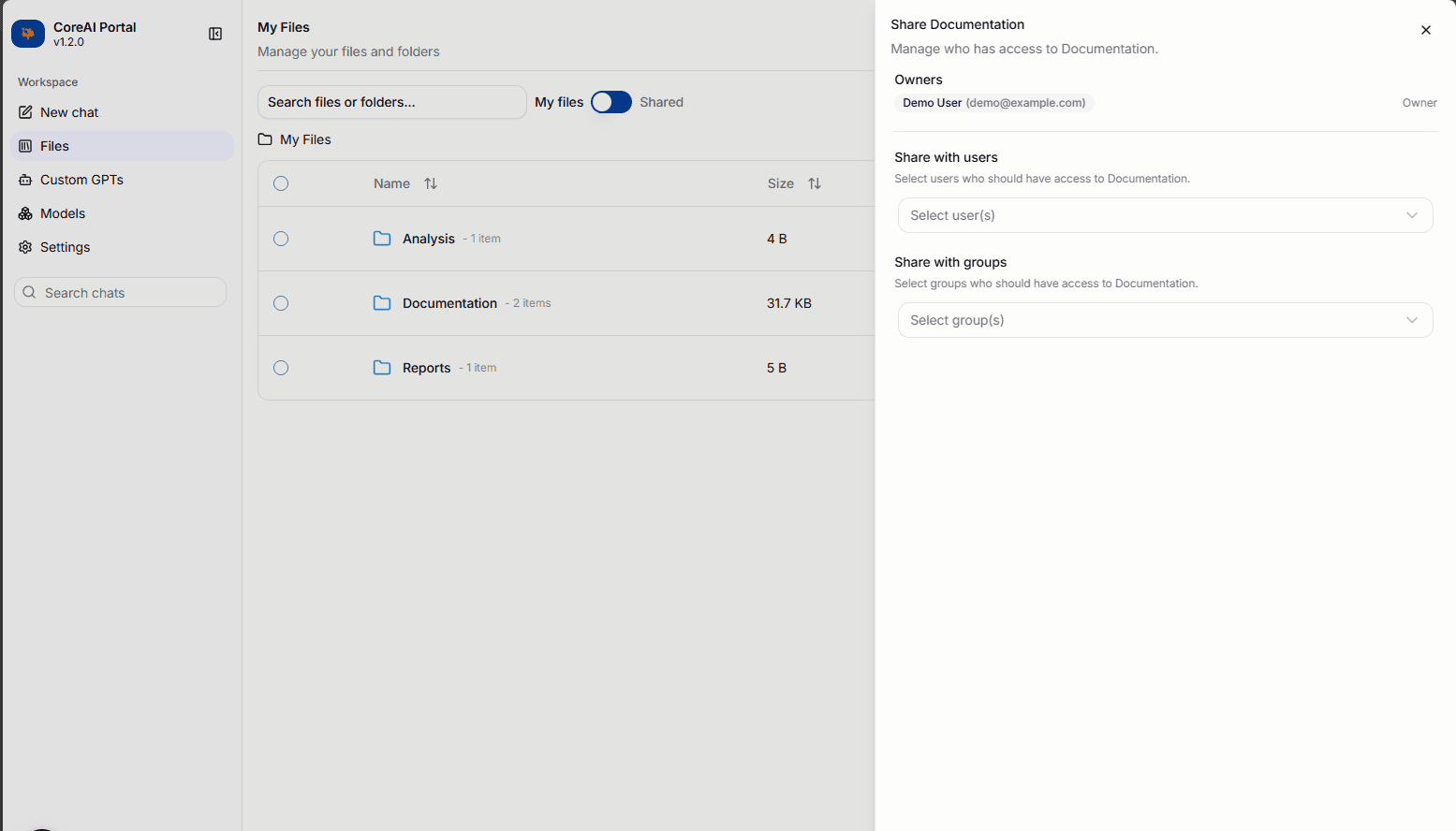
Files and folders can be shared with other users or Keycloak groups.
Opening the Share action on any file or folder opens a slide-in panel with two sections:
- Users — assign or remove roles for individual users in the organization
- Groups — assign or remove roles for Keycloak groups
Available roles are Viewer and Owner. Sharing with a group grants the role to all members of that group.
My Files and Shared views
The Files page has two views, selectable via the filter toggle:
- My Files — files and folders owned by the current user
- Shared — files and folders that have been shared with the current user by someone else
In the Shared view, hovering the shared icon next to a file name shows the owner's name and email.
Folder URLs and bookmarks
When navigating into a subfolder in the My Files view, the browser address bar updates to include the folder's UUID. This means:
- refreshing the page reopens the same folder
- bookmarks and shared links work for individual folders
- the URL remains valid even after the folder is renamed
Folder URLs only update in the My Files view. Navigation within the Shared view does not change the URL.
Permissions
Actions available to a user depend on whether they are in My Files or the Shared view and on their effective role:
| Action | My Files (owner) | Shared — Org admin | Shared — Owner | Shared — Viewer |
|---|---|---|---|---|
| Upload to folder | Yes | Yes | Yes | No |
| New folder | Yes | Yes | No | No |
| Download | Yes | Yes | Yes | Yes |
| Rename | Yes | No | Yes | No |
| Share | Yes | Yes | Yes | No |
| Delete | Yes | Yes | Yes | No |
| RAG retry | Yes | Yes | Yes | No |
Rename is restricted to the original file owner. Org admins cannot rename files they do not own.
Relationship to chat
The Files area is tightly connected to the chat experience.
- files uploaded here become the content source for retrieval
- folders created here can be selected later in the chat
RAGcontrol - files shared with you appear in the chat
RAGpicker when they haveRAG Availablestatus - failed files can be reprocessed here before trying retrieval again
For a deeper platform-level explanation of how uploads become retrieval-ready data, see Files & RAG.
Models
The Models area is the main operational workspace for model visibility, repository management, model import, and inference deployment.
In the current portal, this area brings together three distinct concerns:
Overviewfor models already exposed in the platformRepositoryforMLflow-registered models and versionsDeploymentfor guided model onboarding and serving setup
This part of the portal sits on top of multiple backend services:
LiteLLMfor the user-facing model catalog and routing layerMLflowfor repository-backed model artifacts and version trackingModel Installerfor deployment and import operations
Overview
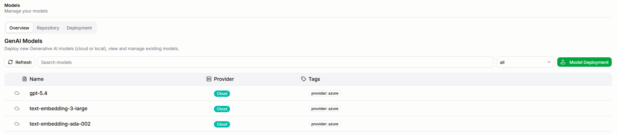
The overview tab is the quickest way to inspect what model capacity is available in the current environment.
Each model in the list shows a vendor logo when the provider is recognized (Meta, NVIDIA, OpenAI, Mistral, DeepSeek, Qwen, Gemma, AMD, Falcon, Grok), an on-premises or cloud badge, and a readiness status indicator.
From here, users can:
- browse the currently exposed models
- search by name, provider, feature, or tag
- filter between
on-premisesandcloudmodels - start a deployment flow from the
Deploy Modelaction
This view is especially useful when users need to confirm which models are actually exposed through the platform before using them in chat, applications, or Custom GPTs.
Model detail page
Clicking a model in the overview list opens its detail page.
The detail page displays:
- Basic information — provider (with vendor logo), model key, model name, API base, timeout, and max retries
- Token limits — max tokens, max input tokens, and max output tokens
- Capabilities — vision support, function calling, tool choice, and assistant prefill
- Tags — any tags assigned to the model
- Supported parameters — the OpenAI-compatible parameters the model accepts
For on-premises models, the detail page also includes:
- a Logs tab showing model runtime logs
- a Delete action for removing the model from inference
Repository

The repository tab is the MLflow-backed model registry view.
It is used for models that have already been imported into the platform repository rather than only being referenced by a live serving URL.
From this area, users can:
- browse registered models
- inspect the latest version and status
- open model details
- deploy a repository-backed model into inference
- delete repository entries if they have the required permissions
Opening a model shows its full detail view: versions with status badges, creation timestamps, tags, artifact URI, and a direct deploy action. If the detail page fails to load, a retry button is shown inline without requiring a full page reload.
At the model-detail level, the portal resolves the latest artifact URI and passes it into the deployment flow. That makes the repository the cleanest path when a model is already present in MLflow and the next step is only to serve it.
Deployment
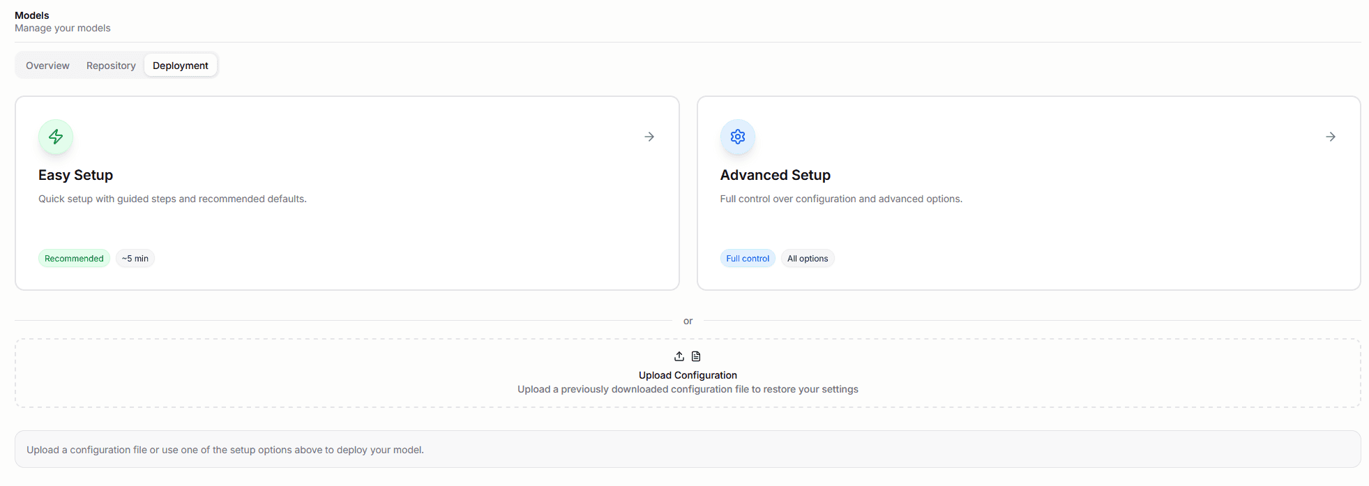
The deployment tab is the guided entry point for making models available for inference.
It offers:
Easy SetupAdvanced Setup- config upload support
This deployment path ultimately bridges to the Model Installer service.
When the user submits a deployment, the portal assembles the deployment payload and calls the backend installer endpoint that registers the model for inference.
Easy setup and advanced setup
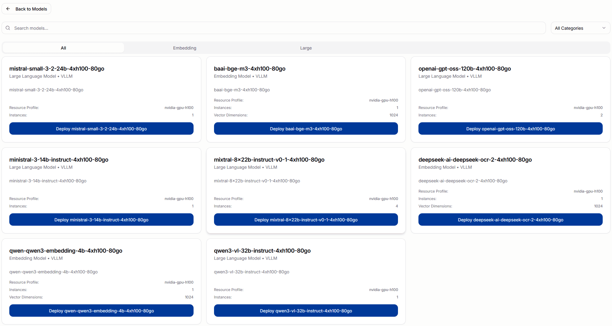
The portal supports two main deployment styles.
Easy Setup is preset-driven.
It:
- lets users browse curated model presets by category
- pre-fills engine, resource profile, features, limits, and tags
- defaults to a simpler installation flow
- allows switching to
Customize Deploymentwhen more control is needed
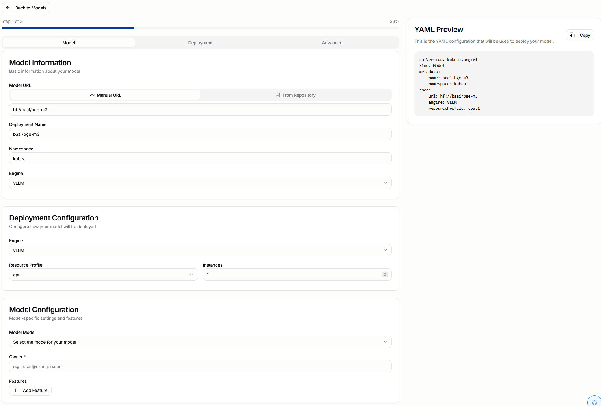
Advanced Setup is closer to the raw deployment contract.
It exposes a fuller deployment form with:
- model source URL or repository-backed source
- deployment name and namespace
- model mode and features
- resource profile and instance count
- scaling and timeout settings
- environment variables and extra arguments
- a YAML preview of the resulting
kubeai.org/v1Modelresource
This is the right path when teams need full control over how the model is served.
Downloader and repository import
The downloader flow is for importing Hugging Face models into the local repository.
The portal collects:
- the Hugging Face model name
- the revision
- the target
MLflowexperiment name - the artifact path, which defaults to
model
When submitted, the portal calls the Model Installer download endpoint and then monitors the import asynchronously.
The current flow:
- starts the import through the Model Installer download endpoint
- polls download status from the Model Installer service
- polls
MLflowuntil the model becomesREADY - checks for failures and surfaces them in the UI
- redirects back to the models area when the import completes
Active downloads show a live status indicator. If a download is already in progress when the user opens the downloader, the existing download status is restored and shown automatically.
An important practical behavior is that this flow imports into MLflow first. It does not automatically deploy the model for inference.
After the model is ready in the repository, teams typically continue with one of these paths:
- deploy from the repository detail page
- open advanced setup with the repository artifact pre-filled
Permissions and operator workflows
Model management actions are permission-sensitive.
In practice, actions such as deployment, download, and delete are gated for users with model-management rights.
So while many users may be able to inspect available models, only authorized users should expect to manage the model lifecycle.
Practical mental model
The simplest way to think about the Models area is:
Overview= what is already available to useRepository= what has been imported and versioned inMLflowDeployment= how a model becomes actively served in the platform
For the platform-level explanation behind these flows, see Models and Model Installer API.
Custom GPTs
The portal includes a Custom GPTs area for creating reusable expert-style assistants on top of the available chat models.
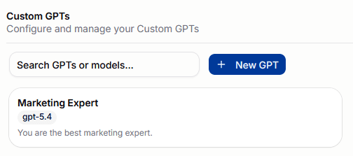
In practice, a Custom GPT is a saved agent configuration owned by the current user.
Each one stores:
- a name
- the selected chat model
- a short description
- a system prompt that defines the expert's behavior
This is useful when users want a repeatable assistant experience rather than starting from a blank chat every time.
Creating a GPT expert
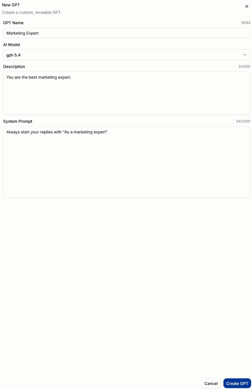
Creating a Custom GPT is a lightweight configuration flow.
Users define:
GPT NameAI ModelDescriptionSystem Prompt
The system prompt is the most important part. It is what turns a general-purpose model into a more specialized expert persona or task-oriented assistant.
Examples include:
- a marketing expert
- a technical documentation assistant
- a support triage assistant
- a domain-specific analyst
The portal loads the available model list from the backend, so the model picker reflects the models that are actually accessible in the current environment.
How it works at runtime
When a Custom GPT is created, the backend stores it as an agent configuration tied to the current user.
At chat time, the portal can send either:
- a raw model name
- or the UUID of a saved Custom GPT
If a Custom GPT is selected, the backend resolves that saved configuration and replaces the chat request with:
- the configured
model_name - the configured
system_prompt
That means the Custom GPT is not a separate model deployment. It is a reusable configuration layer on top of an existing model.
Using a GPT expert in chat

Custom GPTs appear directly in the chat model selector together with the available chat models.
Once selected, the GPT expert becomes the active assistant for that conversation.
The user still keeps the normal chat controls around it, including:
- file upload
RAG- web search when available
- streaming responses
So the Custom GPT defines the assistant's default behavior, while the rest of the chat experience still controls how the conversation is grounded and enriched.
Search and reuse
The Custom GPTs page lets users search both by GPT name and by model.
In chat, recently used models and Custom GPTs are also surfaced first, making it easier to switch back to a frequently used expert.
Sharing a GPT
Custom GPTs can be shared with individual users or Keycloak groups.
The Share button (three-circle icon) appears on a GPT card on hover. It is only visible to the GPT's owner or an org admin.
Clicking the button opens a share sheet titled Share <GPT name>. From there:
- Search for users or groups and add them.
- Assign a role — new additions default to Viewer.
- Change an existing assignment's role using the role dropdown.
- Remove an assignment using the remove button.
- Click Save to apply all changes at once.
The Save button is disabled until at least one change has been made.
Roles
| Role | View and use | Edit (name, model, prompt) | Share with others | Delete |
|---|---|---|---|---|
| Owner | Yes | Yes | Yes | Yes |
| Editor | Yes | Yes | No | No |
| Viewer | Yes | No | No | No |
Only the owner or an org admin can open the share panel. Editors and Viewers cannot reshare.
Changes to a shared GPT require the recipient to refresh the page before they take effect — the GPT list is not pushed to open sessions automatically.
Practical mental model
The simplest way to think about Custom GPTs is:
model= raw model capabilityCustom GPT= saved model + instructions for a specific expert role
If you need the platform-side view of which models exist and how they are configured, see Models.
Settings
The settings area is aimed more at administrators, AI engineers, and platform operators than general end users.
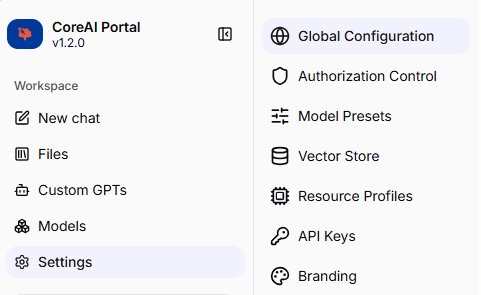
The settings areas covered in this guide are:
Authorization Controlfor users, groups, and access structureGlobal Configurationfor platform-wide AI behavior settings (includes Service Desk, embedding, reranker, retrieval, file size limit)Model Presetsfor reusable model configuration patternsResource Profilesfor managing infrastructure resource allocationsVector Storefor collection management and embedding-backed knowledge dataAPI Keysfor personal API key managementBrandingfor customizing the platform appearance (admin only)
Some deployments may hide certain sections depending on release level and permissions.
Authorization Control
Authorization Control is the settings area where administrators inspect users and groups and manage the role assignments that drive platform permissions.
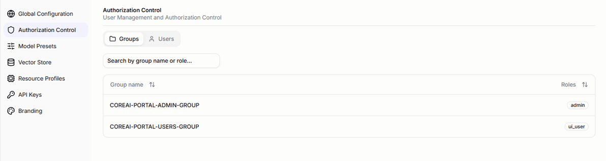
The portal exposes two main views here:
GroupsUsers
Those views are populated from backend authorization endpoints that return Keycloak-backed identities enriched with assigned and computed roles.
What the UI shows
The settings UI fetches:
- the group tree from
/v1/authz/groups - the organization user list from
/v1/authz/users
In practice, this means the portal is not showing only raw identity-provider data. It is showing identity data combined with the authorization state computed from the platform's role model.
For users, the portal can show:
- basic identity details
- group memberships
- directly assigned roles
- inherited roles coming from group membership or role hierarchy
For groups, the portal can show:
- the nested group tree
- directly assigned roles for a group
- inherited roles from parent groups
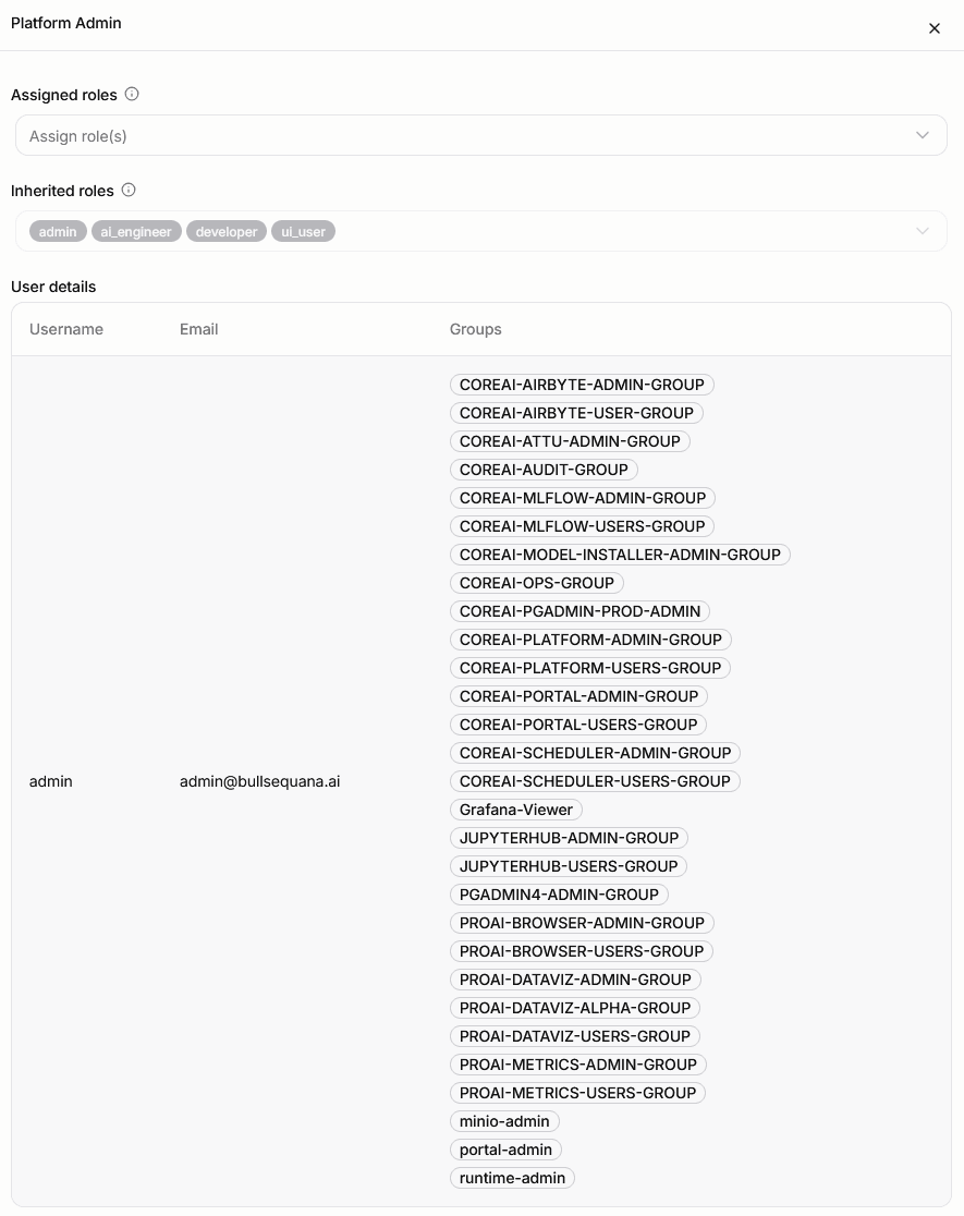
The important distinction is:
assigned rolesare written explicitlyinherited rolesare computed and read-only from the user's perspective in this screen
In the user detail sheet, this becomes very visible: the platform can show a small set of effective inherited roles even when those capabilities are coming from a much larger set of underlying group memberships.
How OpenFGA is used in CoreAI
The actual authorization model is implemented in coreai-llm-backend with OpenFGA.
At schema level, the platform defines:
- direct role assignments such as
assigned_admin,assigned_ai_engineer,assigned_developer, andassigned_ui_user - computed roles such as
admin,ai_engineer,developer, andui_user - computed permissions such as
can_access_api,can_manage_models,can_edit_config, andcan_manage_roles
The implementation deliberately checks permissions in application code instead of hardcoding role names for every action.
That means the code can ask questions like:
can_manage_modelscan_edit_configcan_manage_roles
instead of coupling every feature directly to one specific role name.
Role hierarchy and capability inheritance
The current OpenFGA model defines a role hierarchy and a permission hierarchy.
Examples from the live schema:
admincomes fromassigned_adminai_engineercomes fromassigned_ai_engineerand also fromadmindevelopercomes fromassigned_developer,assigned_ui_user, and also fromai_engineerui_useris computed fromdeveloper
And permissions are then derived from those roles:
can_access_apicomes fromdevelopercan_manage_modelscomes fromai_engineercan_edit_configcomes fromadmincan_manage_rolescomes fromadmin
This is why a user may be allowed to do something even if that capability was not assigned directly to them as a standalone permission. It may be inherited through role relationships.
How group membership affects access
Group membership is synchronized from Keycloak into OpenFGA by a dedicated sync worker.
That worker:
- reads the Keycloak group tree
- writes user-to-group membership tuples into OpenFGA
- writes subgroup nesting tuples into OpenFGA
- can ensure organization roles for selected groups
- caches the group tree for the authorization endpoints used by the portal
This is a key part of how authorization stays aligned with the identity-provider structure.
In practice, if a role is assigned to a group, the members of that group inherit the effective role and resulting permissions through the OpenFGA graph.
How the portal checks permissions
The portal uses permission checks in two ways.
First, the Authorization Control screen itself gates role-management actions with can_manage_roles.
Second, the rest of the portal uses the same permission model to enable, disable, or hide sensitive actions.
Examples in the current portal include:
- Chat, Files, Custom GPTs, and Settings — gated by
can_access_api. Users without this permission see a "permission denied" view instead of the page content, and the corresponding sidebar items are hidden or disabled. - Models area and model management actions (deploy, download, delete) — gated by
can_manage_models. The Models sidebar entry shows a tooltip explaining the restriction when the user lacks this permission. - Model Presets and Resource Profiles settings — gated by
can_manage_models. - Global Configuration — gated by
can_edit_config. - Branding settings — gated by
can_edit_config. - Role assignment and revocation in Authorization Control — gated by
can_manage_roles.
On the frontend, the portal calls /v1/authz/check-permission and /v1/authz/check-role through permission hooks and AuthorizationActionGate wrappers.
If the backend returns 403, the UI treats that as a denied capability and disables or blocks the action accordingly.
Backend enforcement examples
The authorization model is not only cosmetic in the UI.
There are also server-side permission checks in coreai-llm-backend.
Examples include:
/v1/authz/assign-rolerequiringcan_manage_roles/v1/authz/assign-group-rolerequiringcan_manage_roles/v1/authz/revoke-rolerequiringcan_manage_roles/v1/configurationpatch and reset operations requiringcan_edit_config
So the real flow is:
- identity comes from
Keycloak - membership and role tuples are synchronized into
OpenFGA - roles and permissions are computed from the authorization model
- the portal checks those permissions before exposing actions
- backend endpoints can also reject unauthorized actions with
403
Practical mental model
The simplest way to think about Authorization Control is:
Keycloakis the identity sourceOpenFGAis the authorization graph and policy engine- the portal is the management and inspection UI for that graph as exposed through backend APIs
So whether a user can deploy a model, edit shared settings, or manage role assignments depends on the effective permissions produced by that graph, not just on whether the user exists in the identity provider.
Global Configuration
Global Configuration is the operator-facing settings area for platform-wide AI behavior. It is gated to users with can_edit_config permission.
This section controls several subsystems:
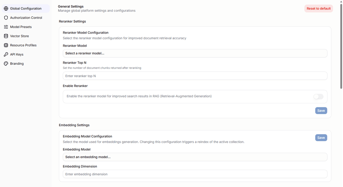
Embedding model
Operators can select the active embedding model, set the embedding dimension, and configure the target collection for vector indexing.
The embedding dimension is a numeric value that must match the output dimension of the selected model. Operators enter it alongside the model selection.
When the embedding model or dimension is changed, a reindex operation is triggered to rebuild the vector index with the new settings. The portal displays reindex status — including active collection, target collection, progress, and any errors — while the operation runs.
During a reindex, the portal shows detailed progress counts: completed, failed, skipped, and total files. While a reindex is pending or in progress, uploads are routed to the target collection so that search continues to serve from the active collection without interruption.
Operators can cancel a running reindex at any time. Cancelling stops the operation and leaves the active collection unchanged.
File size limit
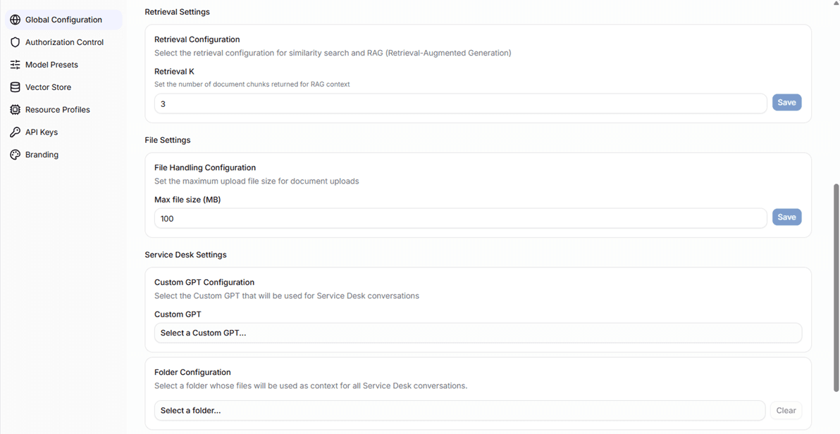
Controls the maximum file size accepted by the Files upload pipeline. Operators set a value in megabytes. The portal patches the backend system configuration immediately on save.
Reranker
The reranker is an optional retrieval step that reorders search results before they are passed to the model.
Operators can:
- enable or disable the reranker
- select the reranker model from available options
- set the
Reranker Top Nvalue — the number of document chunks returned after reranking (range 1–50)
The reranker must be configured (model selected and top N set) before it can be enabled. When active, retrieval results are reordered by the selected model and trimmed to the top N before being assembled into model context.
Retrieval
Operators can configure how many document chunks are returned during similarity search and RAG workflows.
Retrieval K— the number of document chunks returned as RAG context (range 1–50, default 3)
This value controls the breadth of context passed to the model. A higher value provides more context but may introduce noise; a lower value keeps context focused but may miss relevant information.
Reset to default
The Global Configuration page includes a Reset to default action that restores all system configuration settings to their defaults. This affects embedding, reranker, retrieval, file handling, and document processing settings. A confirmation dialog is shown before the reset is applied. This action cannot be undone.
Service Desk configuration
See Service Desk below for the full Service Desk subsection description — it covers Custom GPT selection, retrieval folder, icon upload, branding text, and the enable toggle.
Service Desk
The Service Desk settings are part of Global Configuration (not a separate settings page). They control the AI behavior and appearance of the portal's Service Desk chat widget.
This is an operator-facing configuration section (requires can_edit_config) that answers three runtime questions:
- which Custom GPT should Service Desk use
- which folder should Service Desk use for retrieval grounding, if any
- whether the Service Desk chat should be enabled at all
What gets configured
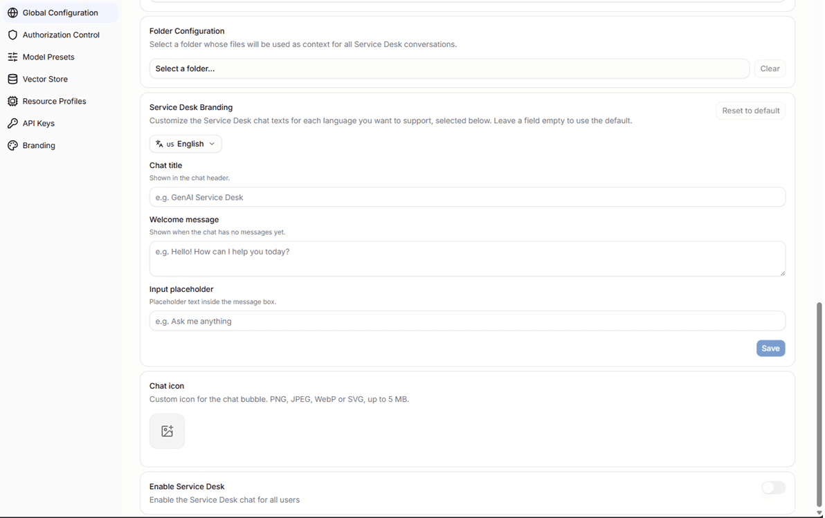
The Service Desk section lets operators choose:
- a Custom GPT — a searchable dropdown lists all available Custom GPTs. The selected Custom GPT defines both the model and the system prompt that drive the Service Desk conversation. This replaces raw model selection: operators choose a pre-configured expert persona, not a raw model name.
- a folder from the Files library for retrieval grounding — optional
The Custom GPT picker is populated from the backend agents API. Any Custom GPT created in the Custom GPTs area is available here.
The folder selector searches the Files library and lets operators choose a single folder. All files in the selected folder are used as the Service Desk retrieval source automatically whenever Service Desk chat is active.
Enabling the feature
The enable toggle is intentionally dependent on having a Custom GPT selected.
If no Custom GPT is configured yet, the Service Desk toggle stays disabled and a tooltip explains why.
Once a Custom GPT is selected, the operator can enable the feature. The retrieval folder is optional — Service Desk can be enabled with only a Custom GPT configured.
This is a practical safeguard: it prevents the portal from exposing a Service Desk chat entry point that has no valid agent configuration behind it.
Editing the configuration
From the Service Desk section, operators can:
- change the active Custom GPT
- add, change, or remove the retrieval folder
- toggle the feature on or off
Service Desk icon
Operators can upload a custom icon for the Service Desk chat widget. The icon appears in the chat in the bottom corner of the portal.
Uploading an icon opens a cropper dialog where the image can be repositioned and scaled before saving. Accepted formats are common image types. If no custom icon is uploaded, the default icon is used.
The icon can be removed at any time to restore the default.
Branding text
The Service Desk settings also include localizable text fields for the chat widget's display name and welcome message.
Operators can set these values independently per supported language (English, French, German, Swedish). The portal shows the text in the language matching the user's active locale.
Where the settings are stored
Service Desk settings are persisted through the backend system configuration API (/v1/configuration).
The stored record includes:
- the selected Custom GPT agent ID (
agent_id) - the selected folder ID used for retrieval
- the enabled flag
- the custom icon (stored server-side, referenced by version token)
- the localizable display name and welcome text per language
What happens at runtime
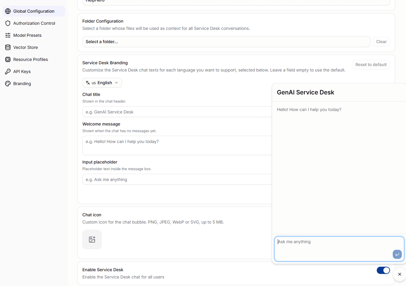
At runtime, the portal layout loads the Service Desk settings and mounts the Service Desk chat only when the feature is enabled.
When it is enabled:
- the Service Desk chat uses the configured Custom GPT — the backend resolves the agent's model and system prompt server-side; the user has no model selector
- it scopes retrieval to the configured folder when one is set
- it displays the configured custom icon in the chat (or the default icon if none is set)
- it shows the localizable display name and welcome message in the user's active language
The Service Desk chat is a locked-down experience: the model, system prompt, and retrieval scope are fixed by the operator configuration. End users only see a message input — no model selector, no file upload, no RAG or web search toggles.
So the Service Desk settings section directly controls both the AI behavior and the appearance of the Service Desk chat widget.
Practical mental model
The simplest way to think about Service Desk is:
Custom GPTsprovides the agent — the model and system prompt the Service Desk usesFilesprovides the retrieval source documentService Deskin Global Configuration binds those together into a locked-down support-oriented chat experience
This makes Service Desk a thin operator-configured layer on top of the existing Custom GPT and Files capabilities rather than a separate AI subsystem.
Model Presets
Model Presets are one of the most important operator-facing settings because they directly feed the guided model deployment flow described in the Models section above.
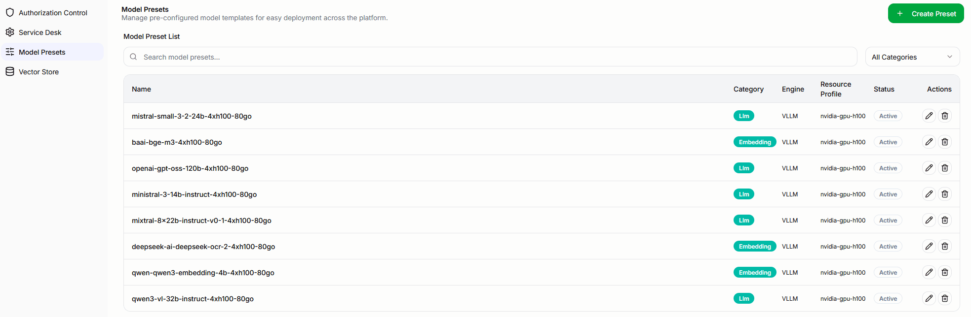
In practice, a model preset is a reusable deployment template stored in the portal database.
The portal uses active presets to:
- populate the
Easy Setupcatalog - group presets by category such as
llm,embedding,audio,multimodal, andrerank - pre-fill deployment defaults when a user chooses a preset
That means model presets are one of the main bridges between platform administration and day-to-day model onboarding.
Preset management view
The settings page lets operators:
- browse all presets
- search by preset name
- filter by category
- create new presets
- edit existing presets
- delete presets
This is the control plane for the curated deployment experience exposed later in Models -> Deployment -> Easy Setup.
Creating a preset
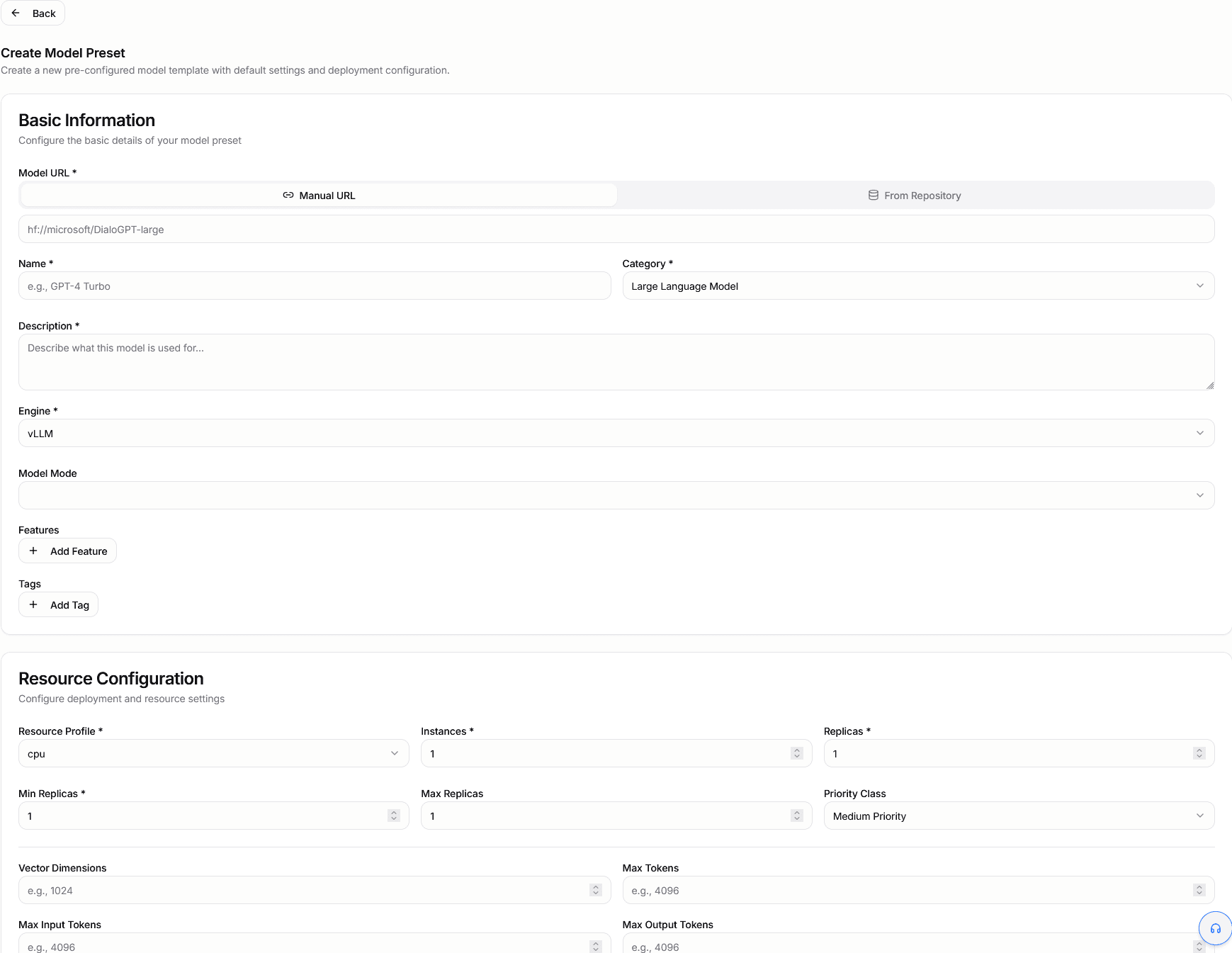
Creating a preset opens a dedicated configuration form where operators define both the model identity and the deployment defaults that should be reused later.

The preset form includes:
- model URL and model name
- category and description
- engine
- model mode
- default features and tags
- resource profile, instances, and replica settings
- token and vector-dimension settings where relevant
- environment variables and arguments
The form also loads active resource profiles so preset defaults stay aligned with deployable infrastructure options.
Why presets matter
Without presets, every deployment would start from a much more manual configuration flow.
With presets, operators can standardize:
- which model variants are offered to users
- which engine and mode should be used
- what default resource profile and scaling values apply
- what tags, features, and limits should be pre-populated
This is why the Easy Setup model catalog can present a curated list of deployable options instead of exposing only a blank advanced form.
Relationship to Models
The relationship is straightforward:
Settings -> Model Presetsdefines curated deployment templatesModels -> Deployment -> Easy Setupconsumes those templatesModels -> Advanced Setupremains available when teams need to override or bypass preset-driven defaults
So when you update a preset here, you are effectively shaping the guided deployment experience available elsewhere in the portal.
Vector Store
The Vector Store settings area is where operators manage the retrieval collections used by CoreAI RAG workflows.

At portal level, this is the main UI for:
- listing available collections
- creating new collections
- inspecting collection size and vector dimensions
- searching documents already indexed into a collection
- deleting documents or whole collections
Under the hood, this section talks to the backend collection APIs implemented in coreai-llm-backend.
What a collection represents
A collection is the retrieval boundary used by the vector store.
In practice, a collection combines:
- stored chunk embeddings in
Milvus - the embedding model name used for that collection
- collection schema metadata
- the document chunks that become searchable through RAG
This means the collection is not just a folder-like label. It is the actual vector-search target used later by retrieval workflows.
Creating a collection
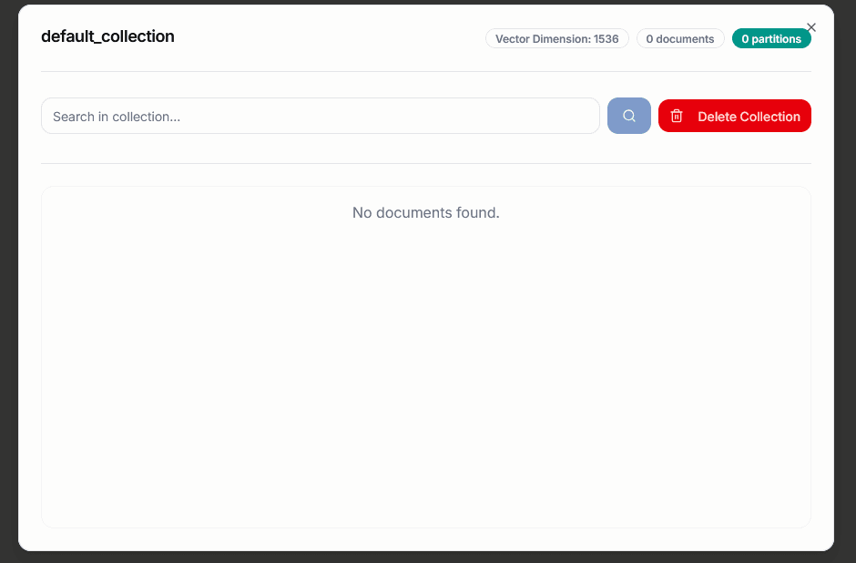
When creating a collection, the portal asks for:
- collection name
- embedding model
- optional description
The portal fetches available embedding models and can preselect the default embedding model when one is marked as default.
When the collection is created, the backend stores the chosen embedding model in the collection schema itself, together with the vector dimension.
That backend schema always includes core fields such as:
document_idembeddingembedding_modelpage_contentmetadata
The backend also creates the vector index with a predefined Milvus configuration, including HNSW indexing and COSINE similarity by default.
Inspecting and searching a collection
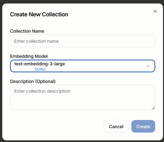
Opening a collection lets operators:
- inspect vector dimension and document count
- browse indexed documents
- run similarity search inside that collection
- delete individual documents
- delete the whole collection
This makes the Vector Store page both a management UI and a practical debugging surface for retrieval quality.
If users are not getting the expected grounded answers, this is one of the first places to check whether the right collection exists and whether the expected documents are actually present in it.
Why the embedding model matters
One important implementation detail is that the embedding model is attached to the collection itself.
In coreai-llm-backend, document processing and vector insertion later call get_embedding_model_from_collection logic to resolve the embedding model from the target collection.
That means:
- users choose the embedding model when creating the collection
- Files and RAG processing do not need users to choose that embedder again for every upload
- the ingestion path automatically uses the embedding model already defined by the collection
This is the reason the Files/RAG pipeline can stay simpler for users while still remaining consistent with the vector-store configuration.
Default collection
The backend document populator currently defines default_collection as its default Milvus target.
That is an important operational convention.
If teams want a standard out-of-the-box retrieval destination, creating a collection named default_collection is the natural baseline choice.
This is especially useful for environments where:
- a shared default RAG target is expected
- Service Desk or other retrieval-backed features need a predictable collection name
- operators want a conventional collection available before more specialized collections are introduced
Relationship to Files & RAG
The connection to the Files and RAG pipeline is direct:
- Vector Store defines the target collection and embedding model
- Files ingestion writes chunks into a collection
- chat and retrieval flows later search that collection
So if you think about the flow end to end:
Vector Storedefines where embeddings liveFilesprovides the source documentsChatandService Deskconsume the resulting retrieval context
For the platform-level pipeline details, see Files & RAG.
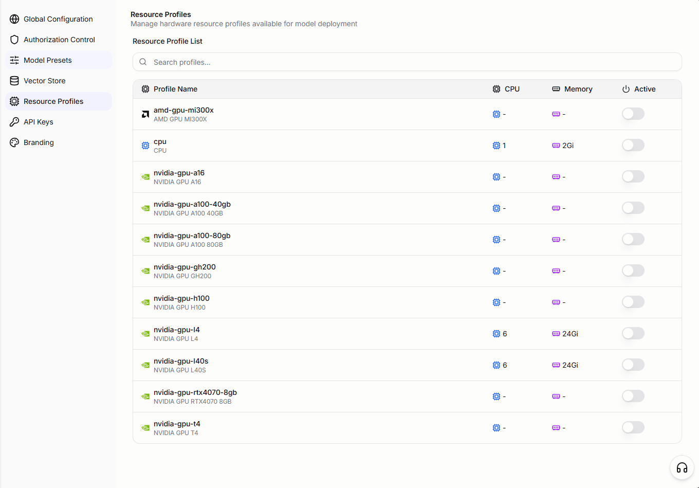
Resource Profiles
Resource Profiles is the settings area where operators view and manage the infrastructure resource allocations available for model deployment.
A resource profile defines a named set of compute resources — such as CPU, memory, and GPU — that can be selected when deploying a model through Easy Setup or Advanced Setup.
From this page, operators can:
- browse all configured resource profiles
- see which profiles are currently active
- toggle profiles on or off to control which options appear in the deployment flow
Resource profiles are maintained by the platform operator and reflect the actual compute resources available in the deployment environment. The list here feeds directly into the model deployment forms and model presets.
API Keys
API Keys allows users to create personal API keys for programmatic access to the CoreAI platform.
The API Keys page is at Settings → API Keys in the sidebar.
Managing keys
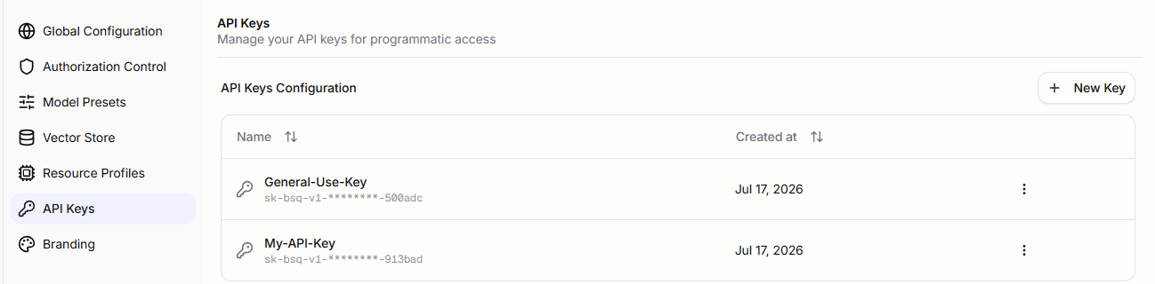
The page lists all API keys belonging to the authenticated user. Each row shows:
- the key name
- a masked representation of the key value (e.g.
sk-****abc) - the creation date
Actions are available per row: Details and Delete.
Creating a key
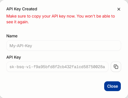
- Click New Key.
- Enter a name (required).
- Click Create.
- Copy the full key secret from the confirmation dialog. The full secret is shown only once and cannot be retrieved afterward.
After dismissal only the masked version is retained.
Key scope
API keys are scoped to the authenticated user. Keys created by one user are not visible to other users.
Branding
Branding is an admin-only settings area (requires can_edit_config permission) for customizing the visual appearance of the platform.
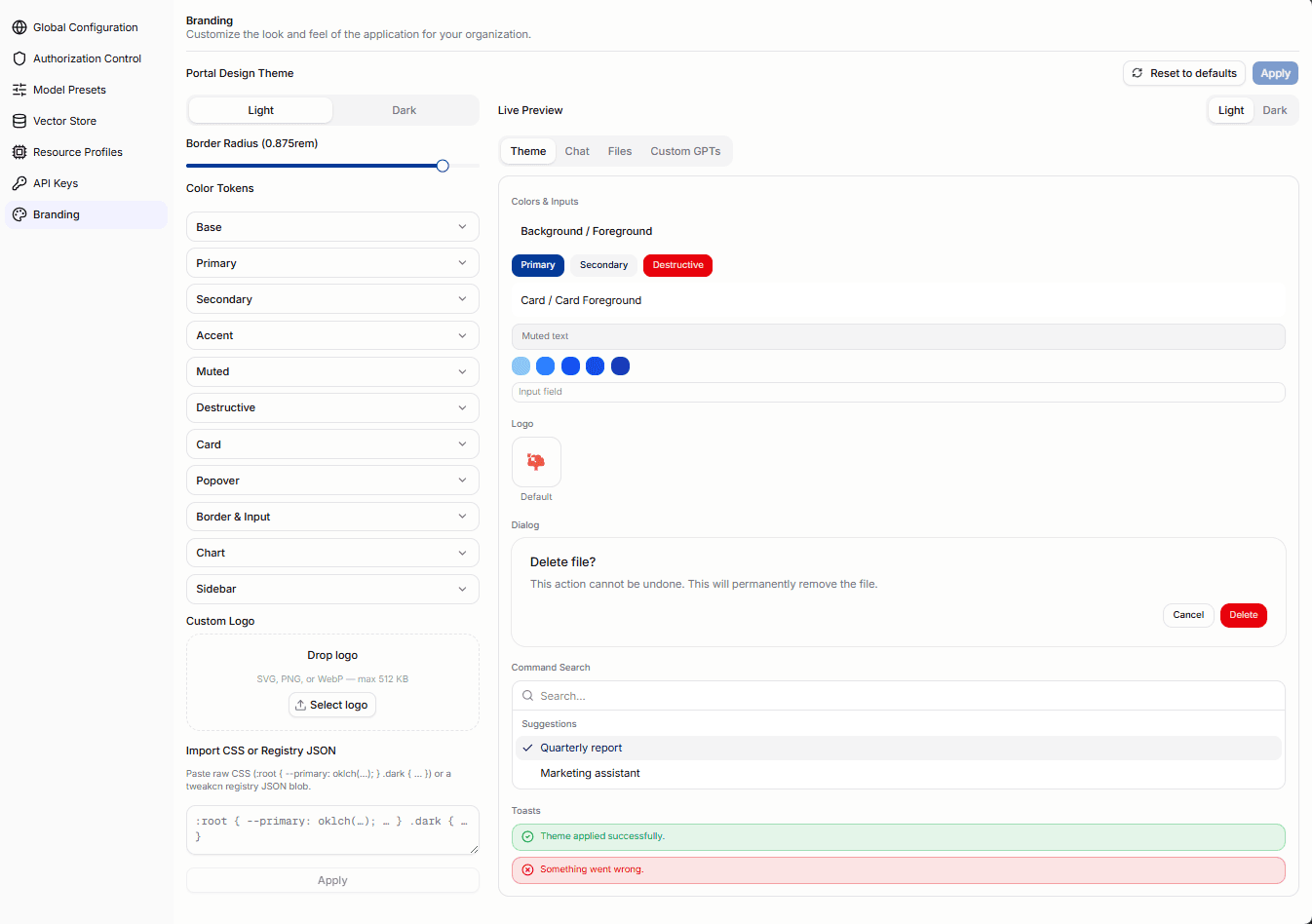
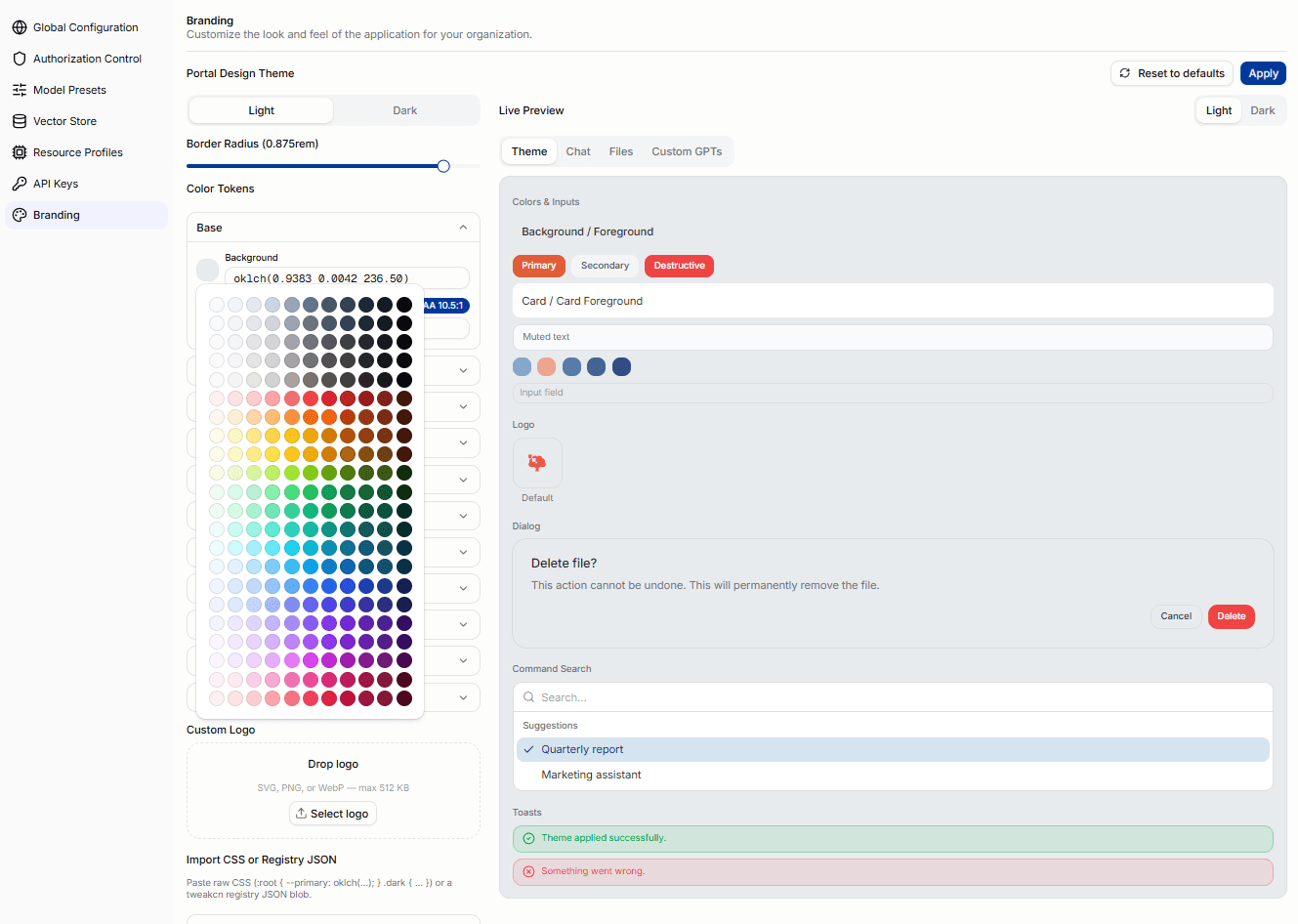
The page is split into two columns: an editor panel on the left and a live preview panel on the right. Changes in the editor are reflected in the preview immediately before being saved to the server.
From this page, administrators can:
- edit the color theme for light and dark mode independently
- adjust the global border radius
- upload a custom logo (SVG, PNG, or WebP, up to 512 KB)
- import a raw CSS theme or a tweakcn registry JSON blob
- preview changes across multiple portal views before applying
- reset to the default shipped theme
How branding is applied
The theme is fetched on every page load and cached locally. It is applied before first paint to avoid a flash of unstyled content. When a theme is applied, all open tabs receive the update immediately through a broadcast channel — no manual refresh is needed.
Color editing
The editor exposes all semantic color token pairs grouped into collapsible categories for both light and dark palettes. The categories are:
- Base — Background, Foreground
- Primary — Background, Foreground
- Secondary — Background, Foreground
- Accent — Background, Foreground
- Muted — Background, Foreground
- Destructive — Background, Foreground
- Card — Background, Foreground
- Popover — Background, Foreground
- Border & Input — Border, Input, Ring
- Chart — Chart 1 through Chart 5
- Sidebar — Background, Foreground, Primary, Primary Foreground, Accent, Accent Foreground, Border, Ring
Each foreground/background pair shows a real-time WCAG 2.1 contrast ratio badge (AA, AA Large, or Fail). If any token pair fails the contrast check, the editor shows an accessibility warning count. Applying a theme with failing contrast ratios requires an explicit confirmation.
The editor shows light and dark mode as two tabs. Each tab has its own independent palette. Changes to one mode do not affect the other.
Border radius
A radius slider controls the global border radius applied to buttons, cards, inputs, and other rounded elements across the portal. The value is shown in rem and applied live in the preview.
Live preview panel
The preview panel on the right side of the page shows how the current draft theme looks across four tabs:
- Theme — color swatches, the current logo, a dialog sample, a command search popup, and toast notification samples
- Chat — a simulated chat conversation with user and assistant messages rendered in the current theme
- Files table — a sample Files page table with folder and file rows, status badges, and size/date columns
- GPT Cards — a sample Custom GPTs card grid showing name, description, model, and shared badge
The preview uses the same components as the live portal, scoped to a preview container. It updates instantly as token values are changed in the editor.
Importing a theme
The editor accepts two import formats via the import text area:
- CSS variables — a block of CSS custom properties in
:root { --token: value; }format, as produced by tools like tweakcn - tweakcn registry JSON — the JSON export from the tweakcn theme editor, which includes both light and dark palette definitions
Pasting or typing into the import field parses the input on-the-fly. If parsing fails, an inline error message is shown. A valid import merges into the current draft without overwriting unchanged tokens.
Logo upload
A custom logo replaces the default product logo in the sidebar. If no custom logo is set, the default logo is shown.
Logos can be uploaded via the dropzone or by clicking the select button. The preview panel's Theme tab shows a side-by-side comparison of the default logo and the new logo before saving.
Font customization is not available. The platform uses bundled fonts only for air-gap compatibility.
Practical Tips
- Use the portal as the fastest way to see which models are currently available to you.
- Use the
Modelsarea before copying model names into developer tools or applications. - Use settings and administrative sections only if your role is meant to manage shared platform behavior.
- If a feature is missing, first check whether it is disabled by role, release level, or deployment configuration.